Role
Creative Director, Brand Strategist & Designer
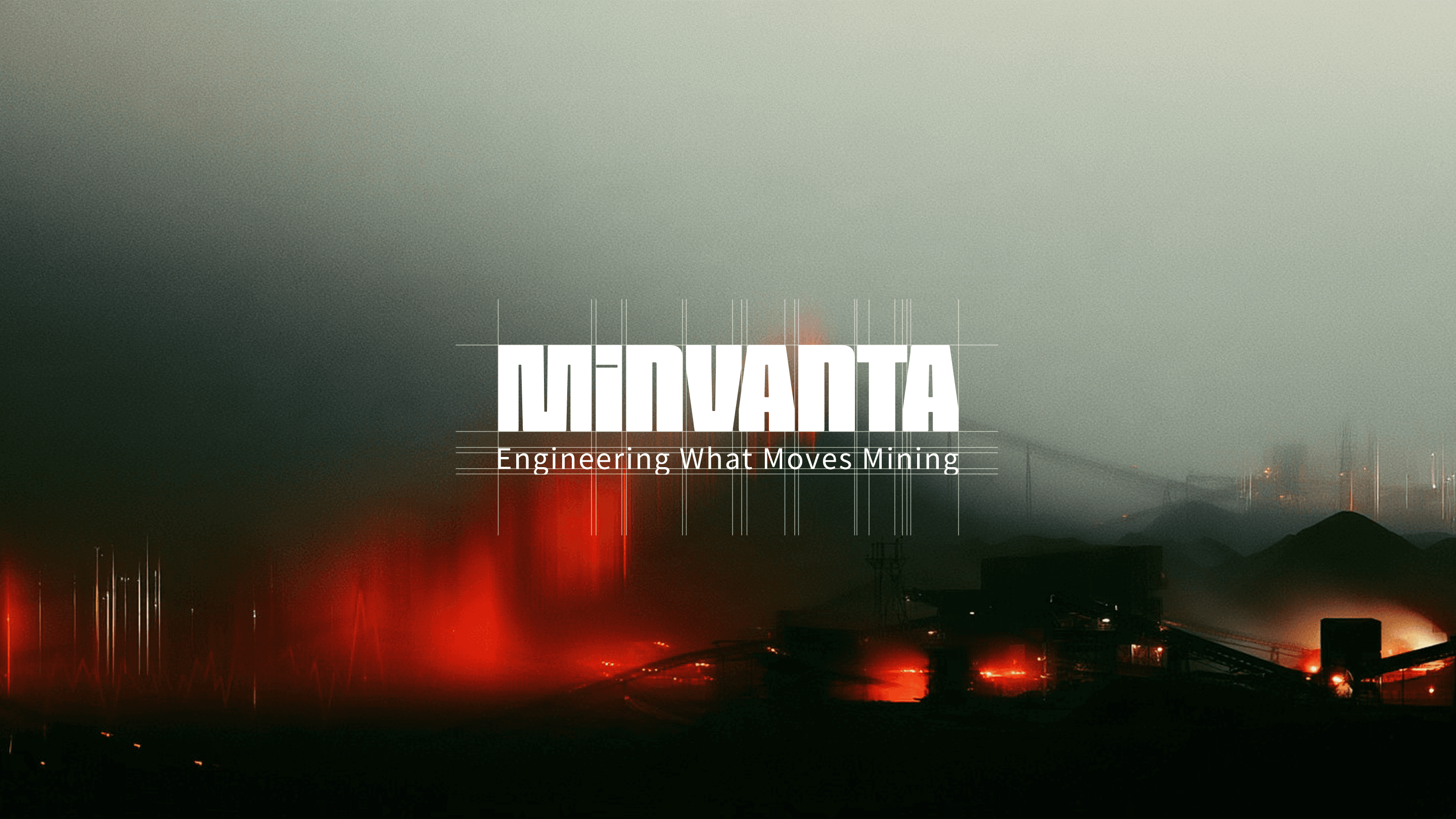
A mining engineering brand built around movement, transforming technical capability into a precise identity, conceptual campaign, and responsive digital system.
 01 / Project frame
Core idea
Movement
System
360°
Platforms
Print + Web
Role
Creative Director, Brand Strategist & Designer
Timeline
Brand platform & launch
Scope
Brand strategy, Brand identity, Creative direction, Campaign development, Digital design system
Challenge
The identity needed to communicate the scale and technical capability expected in mining engineering without relying on the sector's familiar visual clichés. It had to make complex bulk-material handling expertise feel credible, contemporary, and immediately understandable.
Approach
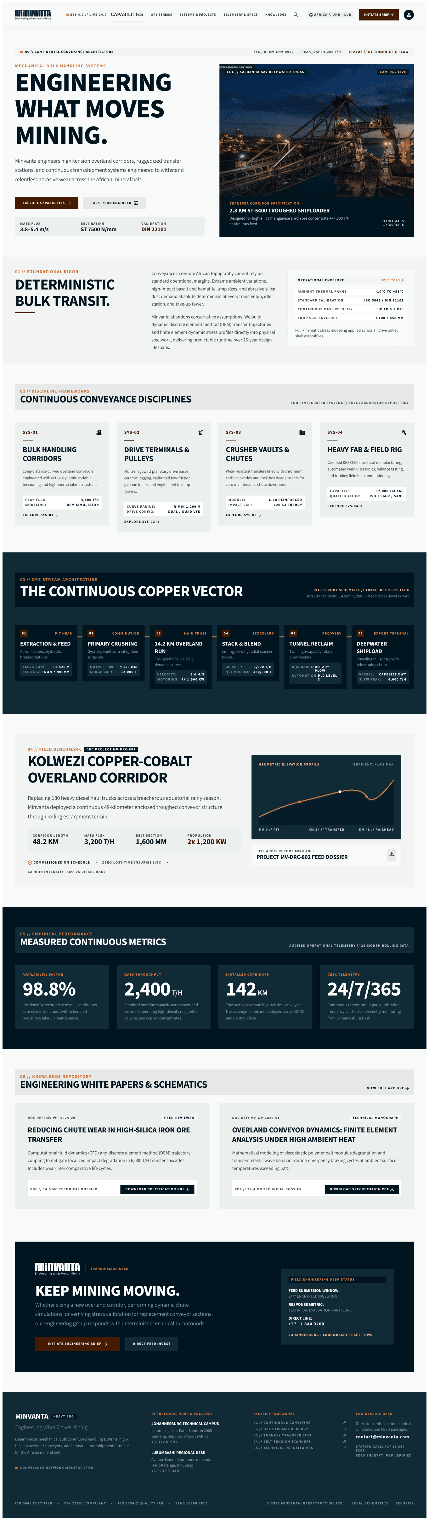
The brand was organised around one fundamental truth: mining depends on movement. A Swiss-influenced grid, monumental engineering photography, restrained mineral colours, and a continuous copper line translated that idea into a coherent identity. The campaign turned engineering truths into memorable metaphors, while a responsive design system extended the same logic into digital interfaces.
Outcome
Minvanta emerged as a distinctive industrial brand with one clear proposition: Engineering What Moves Mining. The system connects strategy, identity, advertising, technical information, and digital product design without losing the precision required by a B2B engineering audience.
Selected applications / 2026

01
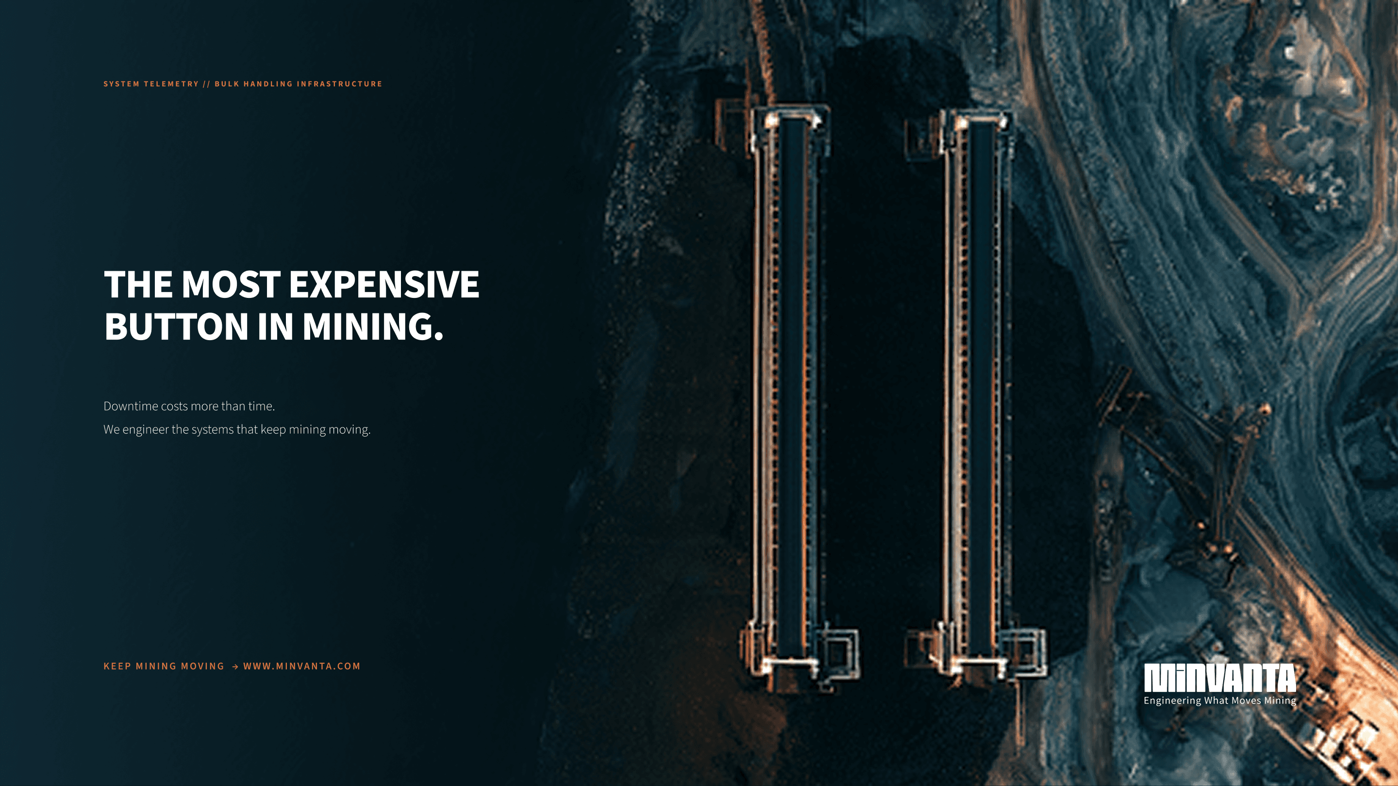
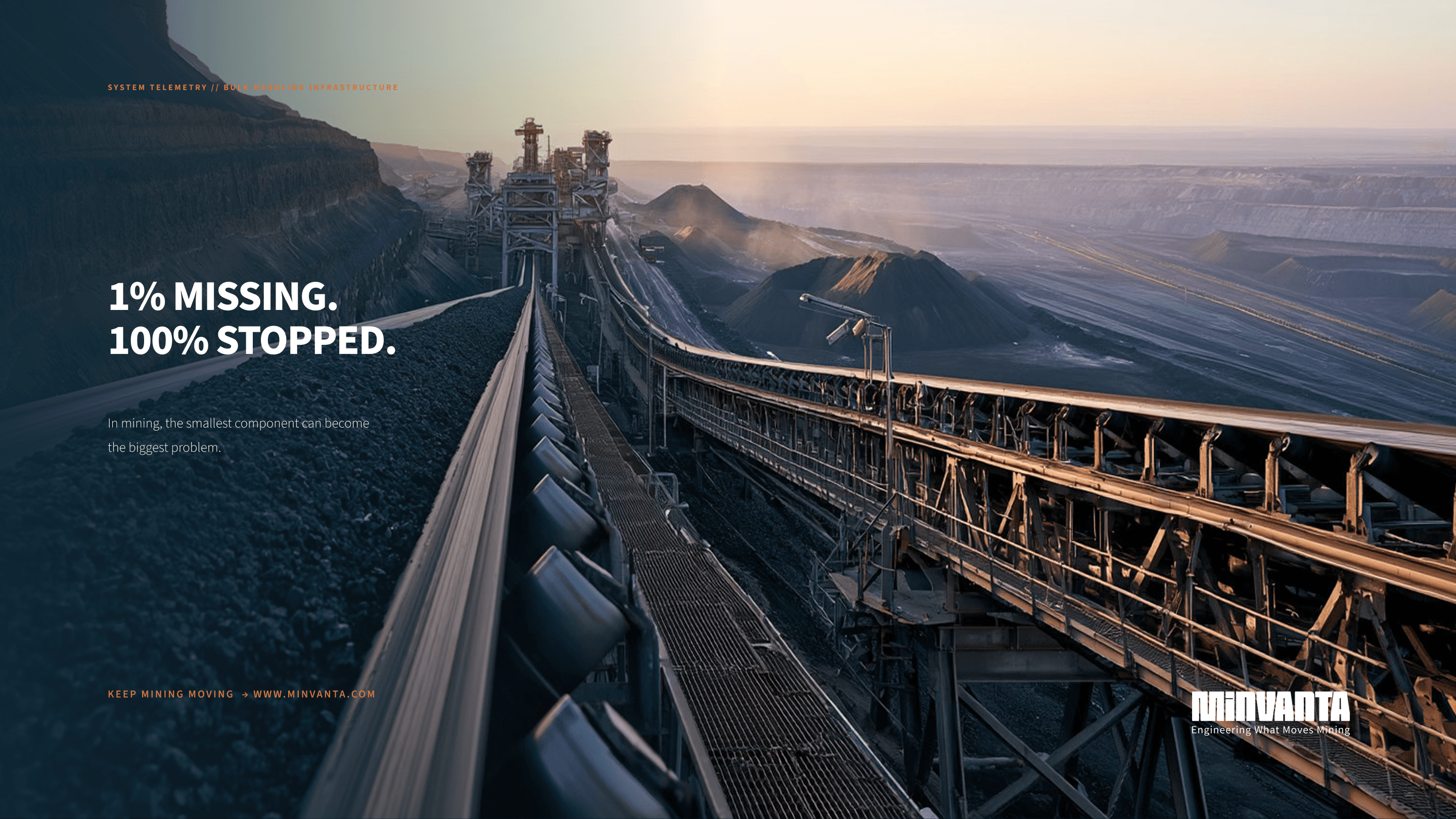
A positioning platform rooted in the operational truth that when material stops moving, production stops.
02
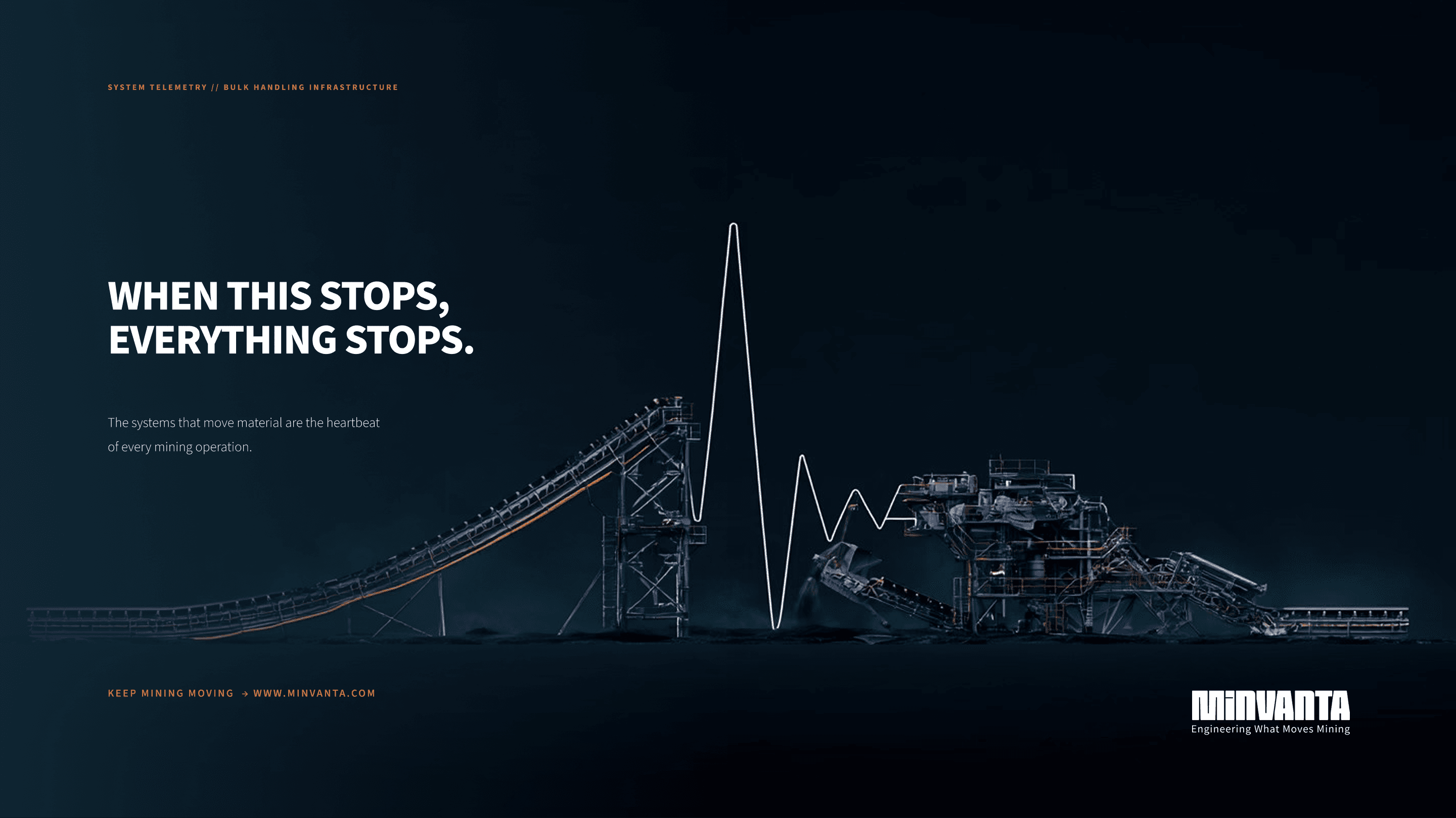
Conceptual campaign executions using the pause symbol, a heartbeat, and system downtime as mining metaphors.
03
A responsive 12, 8, and 4-column digital system for corporate, editorial, and technical content.